How to Make 3 Logos Become 1
A member of my family has a company that seemed like it was in need of a re-brand, or brand, period. I don't know all of the details, but the company has something to do with recycled ink cartridges, I think. Anyways, this week I decided to take a stab at some quick logo ideas.

After asking for a little more information, however, he explained that this company - Ink Express - is actually one of three companies in his wheelhouse, all of which needed to somehow work together at times. Challenge. I played around with a lot of my initial studies, trying to mimic their styles into a full, 3-part graphic family, and came-up short.


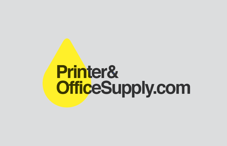

In the end, I thought something sturdy and timeless would hold it's own the best. Each of the individual companies would take-on a pure color (C, M, or Y), and each would use the same style of lettering. The parent brand, which currently has no real name (another topic, another day) would carry an icon that blends all three of those colors, a la an ink cartridge - CMYK brought to life. Iconically, while each do something slightly different, all of these companies deal with ink, so an ink drop was something I kept going back to.


Anyways, this is in no way done, but I thought I'd share a side project none the less.