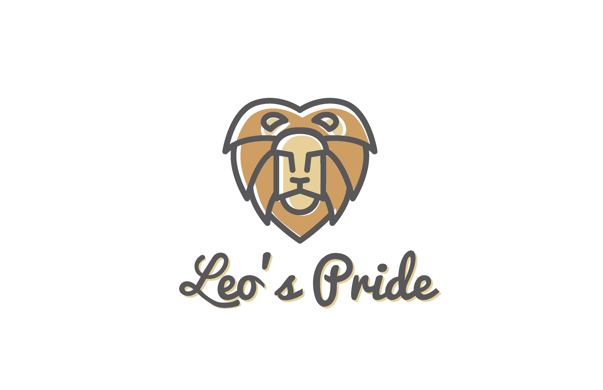
Leo's Pride
I spend most of my time designing branded environments and graphics for large corporations, retailers, universities, etc. It's pretty rare that one of those has any kind of emotional backing, and really rare that there's a personal motivation or cause driving the creative process.
A colleague at work contacted me a couple of months ago about a logo for a foundation her family was forming to raise awareness for spinal muscular atrophy, something her young nephew was diagnosed with at birth. Hearing her story about his condition, his prognosis, and her time with him (especially as my mind continued to refer-back to my nephew who happens to be pretty close in age with this boy) was heart-wrenching.
SMA has four types - her nephew suffers from Type 1, the most severe. The disease progressively breaks-down the body's muscular system and mobility, eventually causing weakness and sensory impairment of the spinal cord and brainstem. Babies diagnosed with Type 1 SMA typically don't live beyond the first two years, meaning every day is a victory and worth celebrating.
Leo, the little boy behind this effort, 'speaks with his eyes.' Like most sufferers of SMA, while the body might deteriorate and the ability to communicate fades, the fire and bravery stays alive in his eyes. That said, his family landed on a lion as a visual marker, and decided to call the foundation "Leo's Pride." While I'm not sure that we've finalized colors + typography, below is a bit of progress - it started with some hand-sketches on simple, brave lions that had strong eyes, and grew into three main concepts - simple and strong, staying away from your typical youthful mascot, all really fun to work on and be a part of.